Erste

Erste

Innovative bank focused mainly on middle-class customers

My role: art director, graphic designer

Agency: DobrýWeb

--

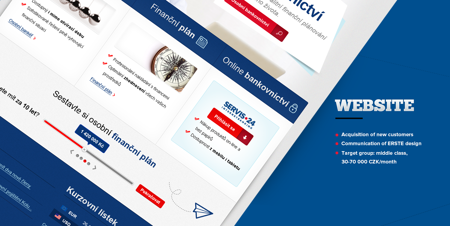
This design was created for ERSTE bank future desktop and mobile websites competition finals. The customer didn't define neither the desired impression nor the design style. Only the functional prototype and basic colours based on the corporate identity were provided. I enjoyed working on this project very much because creating the responsive design for a well-known bank was challenging and rewarding in the terms of experience and possible future application.

Erste

Erste

Innovative bank focused mainly on middle-class customers

My role: art director, graphic designer

Agency: DobrýWeb

--

This design was created for ERSTE bank future desktop and mobile websites competition finals. The customer didn't define neither the desired impression nor the design style. Only the functional prototype and basic colours based on the corporate identity were provided. I enjoyed working on this project very much because creating the responsive design for a well-known bank was challenging and rewarding in the terms of experience and possible future application.

Erste

Erste

Innovative bank focused mainly on middle-class customers

My role: art director, graphic designer

Agency: DobrýWeb

--

This design was created for ERSTE bank future desktop and mobile websites competition finals. The customer didn't define neither the desired impression nor the design style. Only the functional prototype and basic colours based on the corporate identity were provided. I enjoyed working on this project very much because creating the responsive design for a well-known bank was challenging and rewarding in the terms of experience and possible future application.

Erste

Erste

Innovative bank focused mainly on middle-class customers

My role: art director, graphic designer

Agency: DobrýWeb

--

This design was created for ERSTE bank future desktop and mobile websites competition finals. The customer didn't define neither the desired impression nor the design style. Only the functional prototype and basic colours based on the corporate identity were provided. I enjoyed working on this project very much because creating the responsive design for a well-known bank was challenging and rewarding in the terms of experience and possible future application.

Olympia

Olympia

One of major shopping centers in the Czech Republic

My role: art director, graphic designer

Agency: MediaAge

---

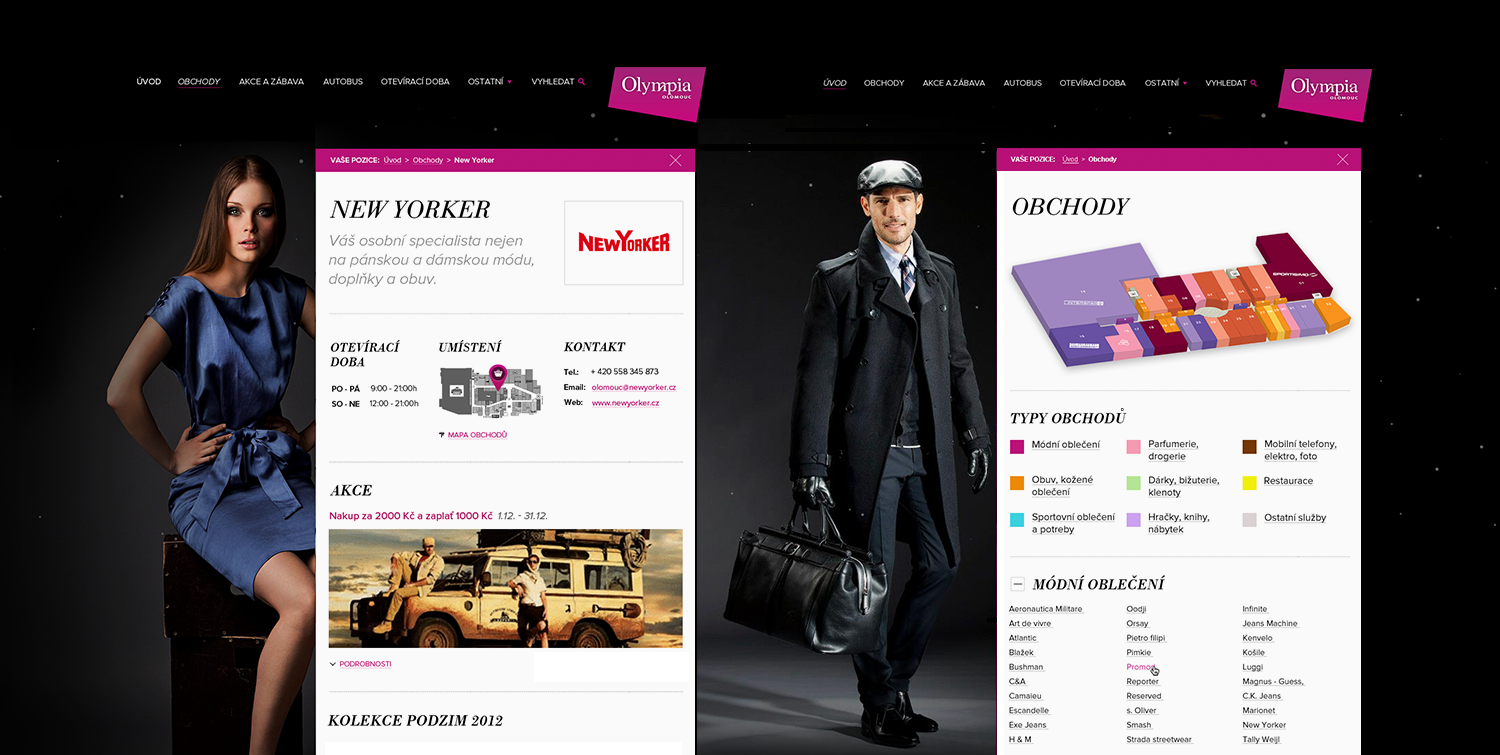
I won an open competition for redesigning the web page of the Olympia Shopping Centre. The customer provided only a very basic design brief and allowed me to create the entire graphic concept by myself. I focused my work on improving the simplicity and usability of the website. To accomplish this goal I completely rearranged the structure and created whole new wireframes. After that I developed new graphic style closely following provided high-resolution images and finished the final design.
Olympia

Olympia

One of major shopping centers in the Czech Republic

My role: art director, graphic designer

Agency: MediaAge

---

I won an open competition for redesigning the web page of the Olympia Shopping Centre. The customer provided only a very basic design brief and allowed me to create the entire graphic concept by myself. I focused my work on improving the simplicity and usability of the website. To accomplish this goal I completely rearranged the structure and created whole new wireframes. After that I developed new graphic style closely following provided high-resolution images and finished the final design.

Olympia

Olympia

One of major shopping centers in the Czech Republic

My role: art director, graphic designer

Agency: MediaAge

---

I won an open competition for redesigning the web page of the Olympia Shopping Centre. The customer provided only a very basic design brief and allowed me to create the entire graphic concept by myself. I focused my work on improving the simplicity and usability of the website. To accomplish this goal I completely rearranged the structure and created whole new wireframes. After that I developed new graphic style closely following provided high-resolution images and finished the final design.

Olympia

Olympia

One of major shopping centers in the Czech Republic

My role: art director, graphic designer

Agency: MediaAge

---

I won an open competition for redesigning the web page of the Olympia Shopping Centre. The customer provided only a very basic design brief and allowed me to create the entire graphic concept by myself. I focused my work on improving the simplicity and usability of the website. To accomplish this goal I completely rearranged the structure and created whole new wireframes. After that I developed new graphic style closely following provided high-resolution images and finished the final design.

Akademie21

Akademie21

Personal portfolio of a business consultant Filip Drimalka

My role: art director, graphic designer

Agency: PORTA

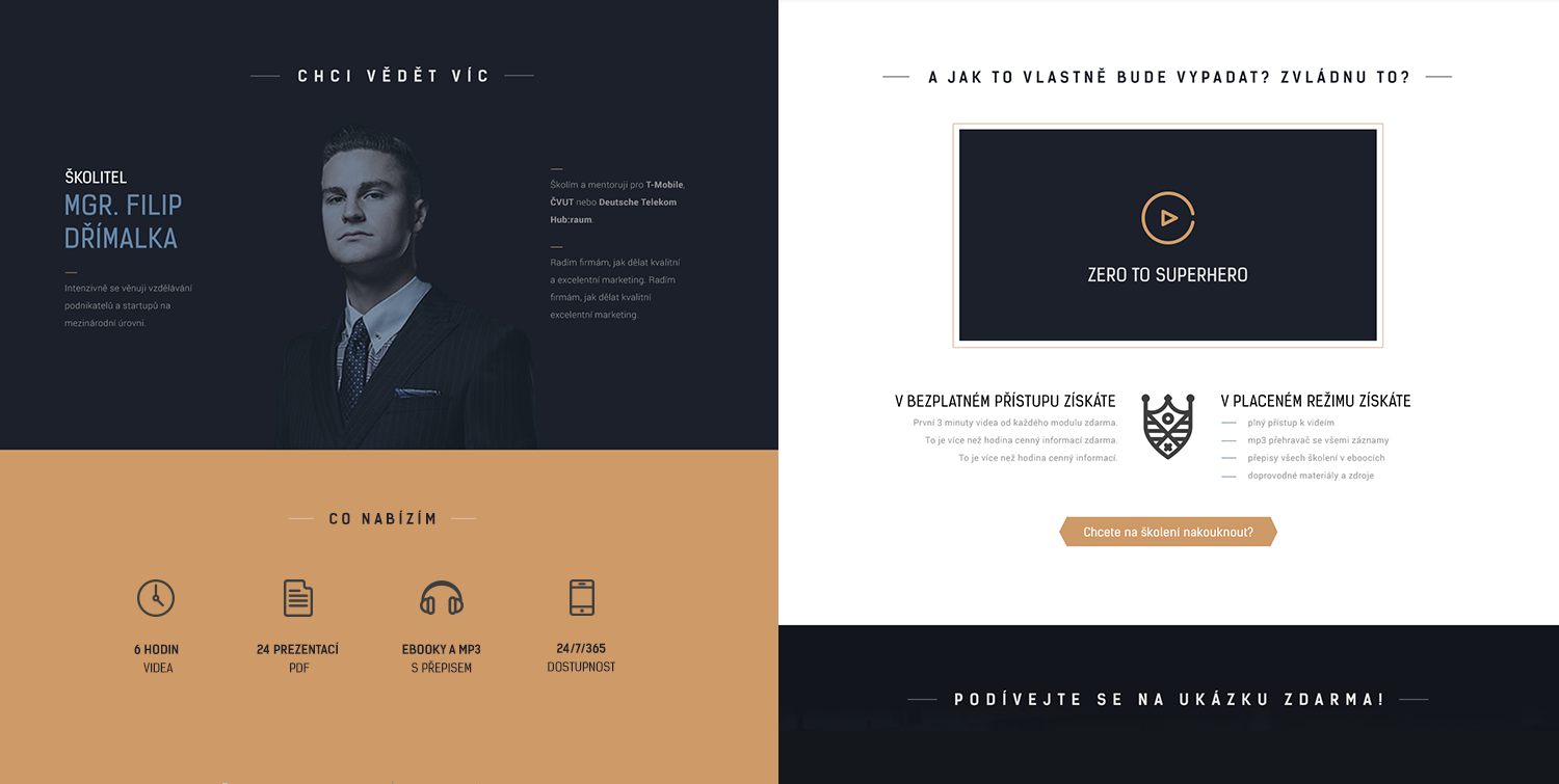
Freedom to design and make decisions made project Akademie21 one of my favourite works. There was no clients vision of colours, typography or overall style. Only a logotype and a motto "Zero to Superhero" were provided. I chose typography, icons and photos very carefully in order to build a minimalistic business-style web around an unusual superhero theme that would engage viewers attention. The client was very enthusiastic and willing to finish the web design in close cooperation.

Akademie21

Akademie21

Personal portfolio of a business consultant Filip Drimalka

My role: art director, graphic designer

Agency: PORTA

Freedom to design and make decisions made project Akademie21 one of my favourite works. There was no clients vision of colours, typography or overall style. Only a logotype and a motto "Zero to Superhero" were provided. I chose typography, icons and photos very carefully in order to build a minimalistic business-style web around an unusual superhero theme that would engage viewers attention. The client was very enthusiastic and willing to finish the web design in close cooperation.
Akademie21

Akademie21

Personal portfolio of a business consultant Filip Drimalka

My role: art director, graphic designer

Agency: PORTA

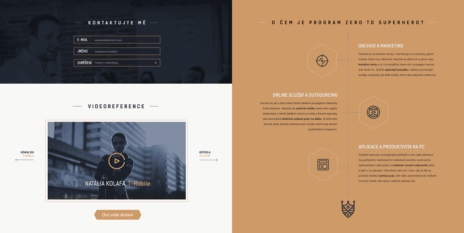
Freedom to design and make decisions made project Akademie21 one of my favourite works. There was no clients vision of colours, typography or overall style. Only a logotype and a motto "Zero to Superhero" were provided. I chose typography, icons and photos very carefully in order to build a minimalistic business-style web around an unusual superhero theme that would engage viewers attention. The client was very enthusiastic and willing to finish the web design in close cooperation.

Other.png